Create custom reports
While you can get started quickly with prebuilt Reports, you can go to the Explore Data tab to get an even deeper view into your data. Use this feature to find a multitude of viewable data that you can narrow down and sort with filters and formulas to create custom reports.
Prerequisites
Before you can use Explore Data, you need to ask your Site Administrator to add you to the qTest Insights Editor group.
Find the data you need
Explore Data is divided into multiple pages, with each covering different types of data. Navigate to the page that contains the data you want to use in your reports.
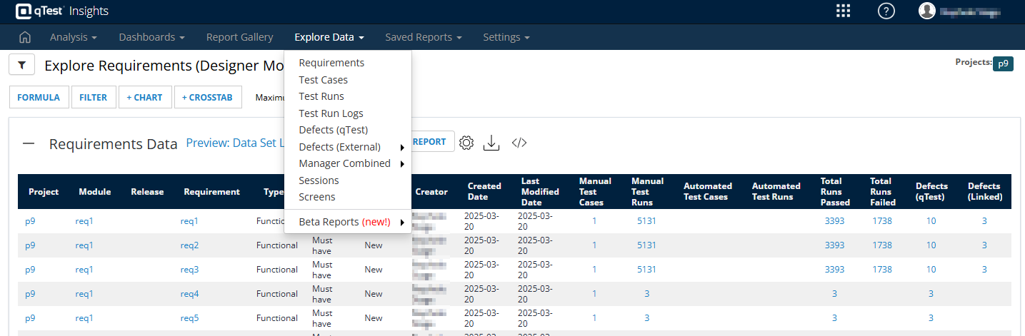
Find the specific data you're looking for in the Explore Data dropdown.
Here's a quick overview of the dataset each page contains:
|
Dataset |
Contents |
|---|---|
|
Requirements |
Requirements created for your projects. |
|
Test Cases |
Test cases created for your projects. |
|
Test Runs |
Test runs created for your projects. |
|
Test Run Logs |
Test logs created from completed test runs. |
|
Defects (qTest) |
Defects created natively in qTest. |
|
Defects (External) |
Defects created in an external ALM that you've connected to qTest. Choose from Jira, Rally, or VersionOne. |
|
Manager Combined |
An overall view of your testing objects across qTest Manager. You can also see objects imported from an external ALM. Choose from Jira, Rally, or VersionOne. |
|
Sessions |
Sessions created in Data Explorer. |
|
Screens |
Screens collected during Data Explorer sessions. |
| Beta Reports (new!) | To find the fastest reports, take a look at what's available under Beta Reports. |
Note that we're currently working to improve Insights performance. As part of this, we're providing more optimized versions of the available reports. Currently, you can find faster versions of the Test Cases and Test Runs reports in the Beta Reports dropdown. Please note that, while these reports should contain exactly the same information as the original reports, they may behave unexpectedly because they are in beta.
Narrow down your data with the Global Filter
Data Explorer provides a bird's-eye view across different parts of your testing process. To make sure you get the most useful information, you can further filter for specific criteria you want to view.
To create a filter, select the ![]() Filter icon. Then, narrow down your dashboard using the available values. The available fields change according to the data you're viewing. Any criteria changes affect the full view.
Filter icon. Then, narrow down your dashboard using the available values. The available fields change according to the data you're viewing. Any criteria changes affect the full view.
Select Refresh Now at any point to apply your filters and reload your report with the latest data.
Refine and visualize your data
Each dataset gives you the tools Formula, Filter, + Chart, and + Crosstab. First, you can use formulas and filters to refine your data to only the points that you find useful. Then, you can use charts and crosstabs to visualize that data.
Expand your data with formulas
Want to know if a requirement is covered by a test case at a glance? Or maybe you're curious how much longer your test runs take than they where scheduled to run. Then you have the perfect opportunity to use a PostgreSQL formula to create a new data column.
Formulas are expressions made of existing data columns, constants, functions, and operators.
-
Data columns are the values that come from your existing data. Depending on the data type in the column you're calling, the value of the column can be a text string, numbers, or date/time values. In formulas, column names are enclosed in square brackets. For example, [Project ID] or [Test Run].
-
Constants are the specific fixed values that don't change during query test tuns.
-
Functions return values, usually calculations based on columns and constants.
-
Operators perform arithmetic and logical comparisons. Note that logical comparisons must be used with SQL Case statements.
If you want to learn more about how to use PostgreSQL, please take a look at the PostgreSQL documentation (opens in a new tab).
Filter rows by cell values
Select the Filter button to filter specific rows by cell values.
Unlike the Global Filter, this filter applies to the cell values, not the cell label. For example, to see which tests are taking longer than expected, you can filter the Sessions Data to include only sessions where the Actual Duration value for the session is greater than the Planned Duration value.
Create a chart
Charts present multiple data points in an easy-to-understand visual format.
Select + Chart to create a chart from any of the data in the Analysis Data table you're viewing. You can create Bar, Line, Curved Line, Pie, Scatter Plot, Heatmap, and Gauge charts.
Create a crosstab
Cross tabulation (or crosstabs) are tables that compare the relationship between two or more variables. Use this function to view the aggregated relationship between different data.
Select + Crosstab to create a crosstab from the data in the Analysis Data table you're viewing.
Save your custom report
When you're done, select the ![]() Filter icon. Then, select Save As and give your report a name.
Filter icon. Then, select Save As and give your report a name.
Access your custom report from the Saved Reports tab under Manage. Refer to Manage and share saved reports to learn how you can use saved reports.
What's next
Happy with the data you've got? Learn how you can share reports with collaborators.