Using Analysis Reports
qTest Insights provides several prebuilt, cross-project reports that can be viewed from three different perspectives including Quality, Coverage, and Velocity.
Using Analysis Reports
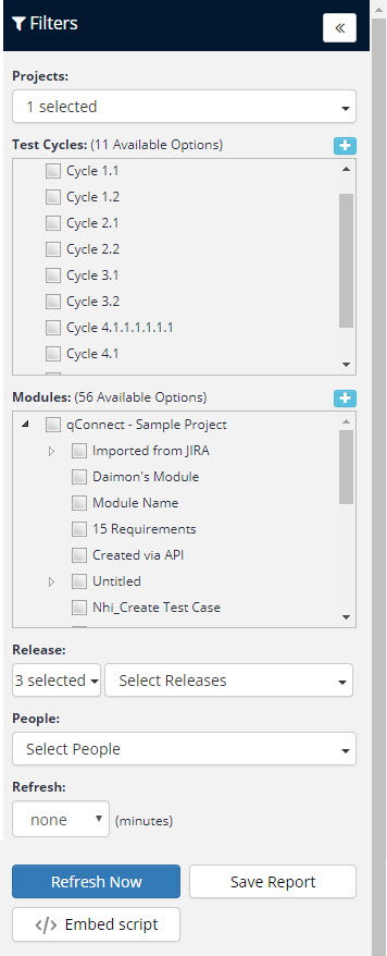
To begin, you should set your Global Filter for the criteria you would like to view:
-
Select the Global Filter icon to choose one or more values for Projects, Test Cycles, Modules, and Releases to filter your Analysis report data. Any change to the criteria will affect the entire report view.
-
You can set a global value to automatically refresh data at your expected interval of either 1, 2, 5, 10, or 20 minutes.
-
Select the Refresh Now icon to automatically reload your reports with the latest data.
-
Select the Save Report icon to save each Analysis report to the Manage Reports section of qTest Insights. This will allow you to manage or schedule the report later on.
Refer to Manage and Schedule Reports for information on managing and scheduling reports.
Quality Analysis
Below are some helpful tips for navigating the Quality Analysis report.
From the menu Analysis menu, select Quality to open the Quality Analysis page.
-
There are three quality charts:
-
Latest Test Run Results: The results from the latest Test Runs of each Test Case.
-
Test Results by Day: A breakdown of the Test Run results by day.
-
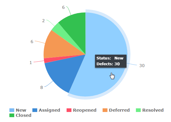
Defect Status: Shows the distribution of Defects by status.
-
-
Click on each tab to show data broken down by project, and Test Cycle.
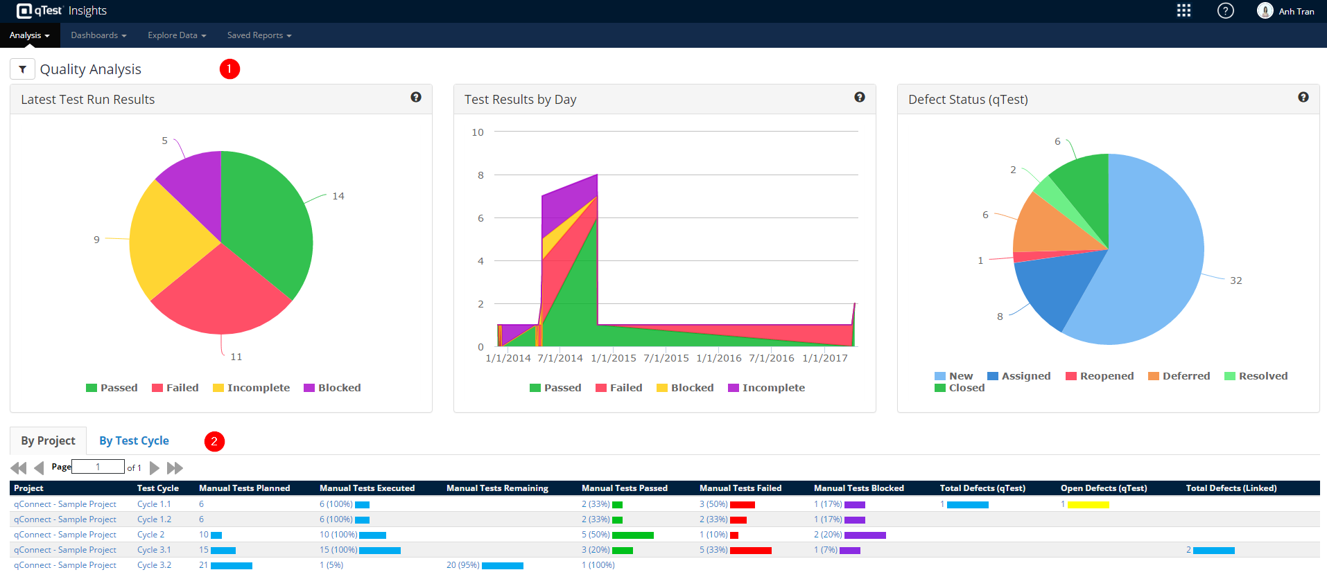
Hover to See Data
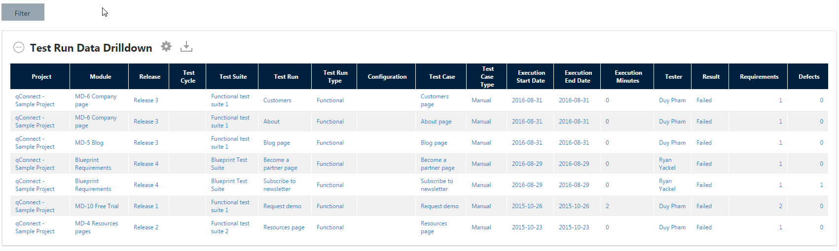
Click to drill-down for details
For more information about drill-down pages, refer to Using Drill Down Pages.
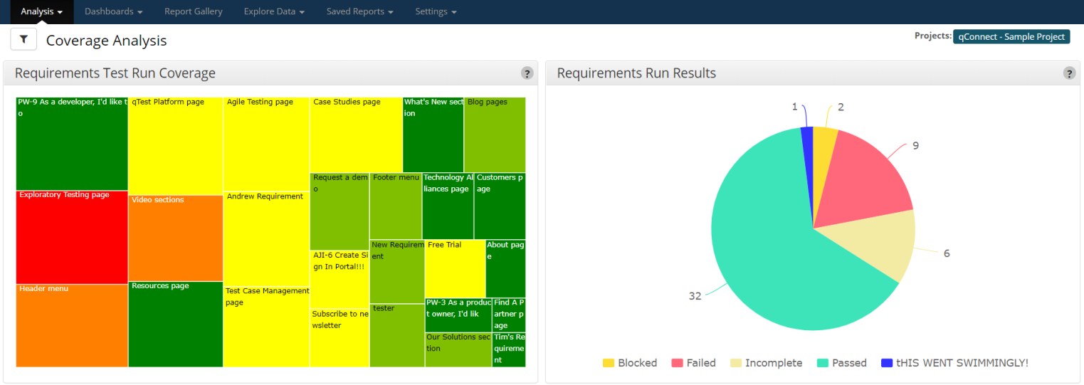
Coverage Analysis
The Coverage Analysis report helps you determine test case and execution coverage as it related to requirements and application areas. Below are some helpful tips on navigating the Coverage Analysis report.
Overview
From the Analysis menu, select Coverage to open the Coverage Analysis page.
Coverage Analysis Charts
-
Requirements Test Run Coverage: The heat map is set up so that the size of each box is based on the number of Test Runs and the color of the box is based on the number of failed runs. Dark green is the lowest number of failures and bright red is the highest number.
-
Requirements Run Results: The results from the latest Test Run of each Test Case covering the Requirements.
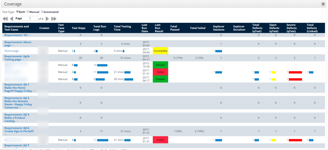
Use the Coverage Table
-
Test Type: Allows you to filter out manual vs automation Test Run data for the analysis data table.
-
Analysis Data Table: This table shows the Test Cases for each requirement along with the testing results and number of Defects. The followings are some explanations for several fields in the table.
-
Explorer Sessions: The count of Explorer Sessions associated with a specific Test Case and Requirement. (An Explorer Session must be linked to a Test Run which then linked to a Requirement to be counted.)
-
Explorer Time: Total time spent in Explorer sessions associated to a specific Test Case and Requirement.
-
Open Defects (qTest): The count of qTest Defects whose status are either New, Reopened, or Assigned.
-
Severe Defects (qTest): The count of qTest Defects whose severity are either Fatal, or Major.
Hover to View Data
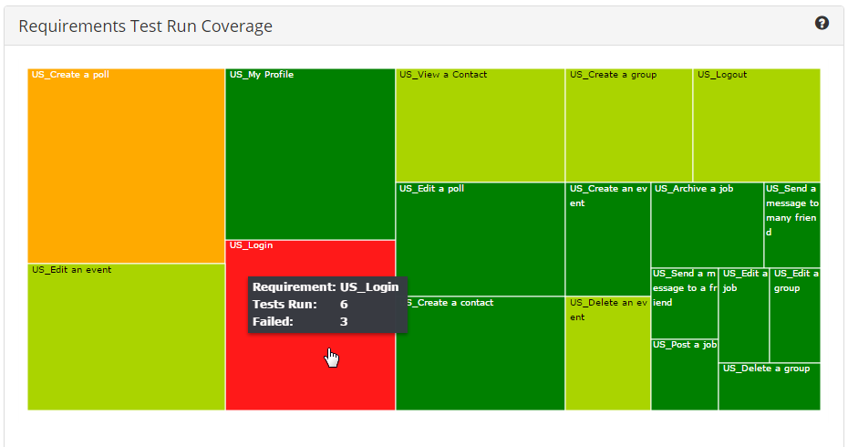
Click the Heat Map to drill-down to details
Velocity Analysis
The Velocity Analysis reports are not only about how fast your team is progressing but they also help you estimate the remaining workload.
You can access the Velocity Analysis reports on the Velocity Analysis page. To do so, select Velocity from the Analysis menu.
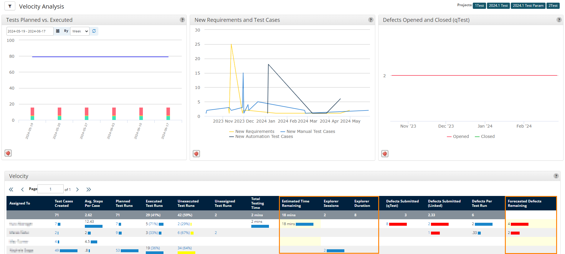
The Velocity Analysis charts and analyzed data table display the amount of remaining work.
Velocity Analysis charts
The Velocity Analysis charts display information in an interactive graph. You can hover over any of the data points on the charts to view the date of the data point, as well as any details associated with that data point. Depending on the data point you hover over, this information can include the amount of planned or executed test runs, the number of new requirements or test cases, or the number of opened or closed defects.
There are three velocity metric charts:
-
Test Planned vs. Executed: Cumulative results by day for the number of tests planned and executed, along with their execution results.
You can select a custom date range for the data you want to view in this chart. If you select multiple releases in the
 Filter, the chart displays the earliest start date and the latest end date for the selected releases.
-
New Requirements and Test Cases: Number of requirements and test cases added by day. Test cases are categorized into manual and automated.
-
Defects Opened and Closed: Number of defects opened and closed by day.
Analyzed data table
The Velocity analyzed data table includes the following unique columns:
-
Estimated Time Remaining: Based on the time the tester spent on each test step and the number of test steps that remain.
-
Forecasted Defects Remaining: Based on the number of defects the tester found per test run and the number of test runs that remain.
-
Explorer Sessions: The count of Explorer sessions that the tester conducted.
-
Explorer Duration: Total time that the tester spent conducting Explorer sessions.
The Velocity analyzed data table breaks down activities and results for each individual tester.
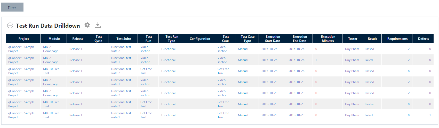
You can select any data point on this chart. This lets you access the drilldown report, which provides detailed information for each data point, such as Project, Test Case, or Module.