Graph panel
When you open a Test Result, the Overview tab of the Test Result view gives a graphical overview of the Test Result.
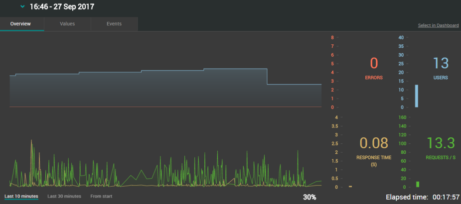
Running test graph
This graph displays the Test Result with curves representing the correlation of the following metrics:
Errors/Load
-
Average number of requests containing errors
-
Number of Virtual Users executed
with
Requests
-
Average request response time
-
Average number of requests executions
Tip: By default, runtime graphs of the Test Result view display the last 10 minutes of the test. It is yet possible to switch to a larger history mode in order to display more or all test data. See Change the time window of the graph for more information.
First graph
The first graph gives an overview of the load:
-
The red curve shows the total number of requests containing errors, its Y-axis is common to the graph and to the graph indicator.
The last numerical value is displayed in red on the right of the graph in the Graph indicators panel.
-
The blue curve shows the total number of Virtual Users executed in the test, it has its own Y-axis on the right.
The last numerical value is displayed in blue on the right of the graph in the Graph indicators panel.
Second graph
The second graph gives an overview of the requests:
-
The yellow curve shows the requests response time in seconds, its Y-axis is common to the graph and to the graph indicator.
The last numerical value is displayed in orange on the right of the graph in the Graph indicators panel.
-
The green curve shows the total number of requests executed per second, it has its own Y-axis on the right.
The last numerical value is displayed in green on the right of the graph in the Graph indicators panel. When no requests are executed, no points show and there is no curve.
X-axis
It represents elapsed time on a sliding window representing the whole duration of the test.
The most recent point of the graph is at the right of the graph: it corresponds to the latest value received from NeoLoad.
Elapsed time is expressed in HH:MM:SS.
A progress indicator with percentage of time completed is displayed only if an end date/time has been planned for the test.
Y-axis
It is indirectly represented by the columns of the Graph indicators.
-
Graph indicators
They show the latest value received from NeoLoad (the last point displayed on the right of the graph).
Note: Granularity, i.e., the time interval between two plotted points on a same curve, is identical to the one defined in NeoLoad.
Change the time window of the graph
The Overview tab of the Test Result view gives a graphical overview of a Test Result.
By default, runtime graphs of the Test Result view display the last 10 minutes of the test. It is yet possible to switch to a larger history mode in order to display more or all test data.
Note: This only applies to tests that are currently in progress.
To change the time sliding window, follow these steps:
-
From the Home or Search view, open a running test. For more information, see how to open a test.
You are led to the Overview tab of the Test Result view that displays predefined metrics of the 10 last minutes of the running test.
-
Click one of the buttons below the graphs to display the data period you want to analyze.
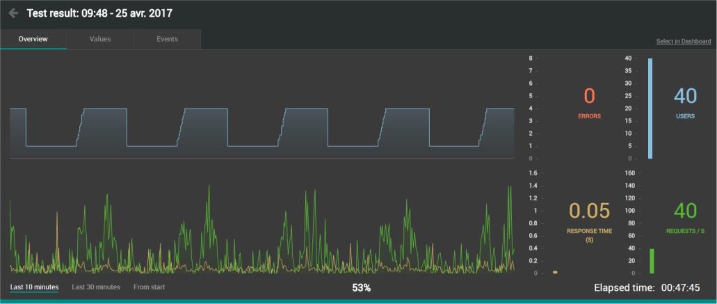
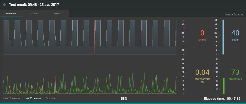
Example with "Last 30 minutes":
Example with "From start":
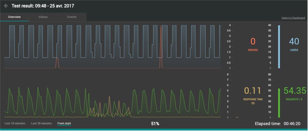
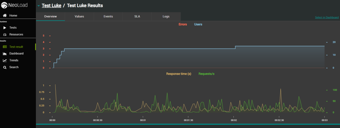
Finished test graph
When you open a test, you get a graphical overview of the test thanks to the correlation of the following metrics:
Errors/Load
-
 Average number of all errors that might occur in the test. The errors can be generated by: Requests, JavaScript actions, Custom Actions and Push messages.
 -
 Number of Virtual Users executed.
with
Requests
-
 Average request response time.
 -
 Average number of requests per second.
Note: Granularity, i.e., the time interval between two plotted points on a same curve, is identical to the one defined in NeoLoad.
-
X-axis
It represents elapsed time, starting from the beginning of the test (the entire test is visible without the need to scroll).
-
Y-axis
Each graph has its own Y-axis. Each axis tick has the same color as its associated curve (Example: RESPONSE TIME/S yellow curve has its vertical axis with yellow ticks).
First graph
-
The red curve shows the total number of errors, its Y-axis is common to the graph and to the graph indicator.
-
The blue curve shows the total number of Virtual Users executed during the test, it has its own Y-axis on the right.
Second graph
-
The yellow curve shows the response time in seconds, its Y-axis is common to the graph and to the graph indicator.
-
The green curve shows the total number of requests executed per second, it has its own Y-axis on the right.
Tip: As you point the mouse cursor over a time segment on one of the two graphs, the associated metric values are displayed as illustrated below. Besides, you can synchronize the 4 metrics by pointing the mouse cursor over the same time segment.
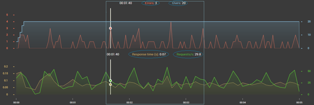
Tip: You can hide any curve by clicking their respective legend above the graph.