Graph features
Zoom
Click and hold on the mouse button to select the rectangular area to zoom in on. The zoom takes effect when the mouse button is released.
Press and hold the CTRL key to obtain a zoom area that automatically takes in the entire vertical space. Click on the graph to return to normal view.
Pop-up menu
Right-click on the graph for the following options:
-
Display the properties of the graph
-
Delete a graph curve
-
Delete the whole graph
-
Maximize or minimize the graph
-
Display or hide alert zones and thresholds
-
Export the Export graph as a PNG image or a CSV file (available in the analysis view only)
-
Print the graph (available in the analysis view only)
Granularity
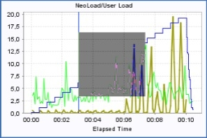
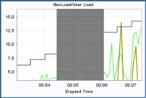
Granularity is the time interval between two plotted points on a same curve for a specific test duration.
A low granularity produces a more readable curve, whereas a high granularity produces a more accurate curve.
Default granularity of graphs can be configured in Edit > Preferences > Graphs.
It is possible to overwrite the default graph granularity for a specific graph and update its granularity directly in the Runtime and Results sections.
To overwrite the granularity of a specific graph, follow these steps:
-
Select the graph you want to modify.
-
Click
 on the vertical toolbar.
A vertical slider with values range: Most, More, Default, Less, Least appears.
-
Select the granularity you want to apply on the selected graph. See the examples below to help you choose the granularity best suited for your graphs.
The selected granularity is updated when you release the mouse from the slider.
Example: For a test lasting 20 minutes, NeoLoad will aggregate the values recorded each second to produce a point every:
With "Standard" default granularity configured in Edit > Preferences > Graphs > Granularity:
-
10 seconds if you choose "Default"
-
5 seconds if you choose "Most"
-
5 seconds if you choose "More"
-
20 seconds if you choose "Less"
-
40 seconds if you choose "Least"
With "Highest" default granularity configured in Edit > Preferences > Graphs > Granularity:
-
5 seconds if you choose "Default"
-
1 seconds if you choose "Most"
-
1 seconds if you choose "More"
-
10 seconds if you choose "Less"
-
20 seconds if you choose "Least"
Caption bar
The caption can be sorted out by column with a click on the column title. The following columns are available:
-
View displays or hides the curve. This does not change the other curves or the scale factors.
-
Color is the curve color. It can be edited with a double-click to display the color picker.
-
Scale is the scale factor. All the curve values are multiplied by this factor before being plotted.
-
Test is the name of the test associated with the curve.
-
Name is the name of the element being plotted (web page, HTTP request, Monitor...).
-
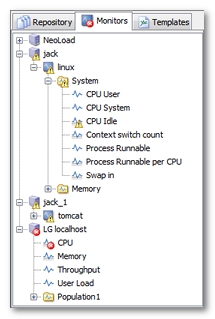
Statistic is the statistic name. It is empty when unavailable. For more information, see Filter by Zone, Population or Virtual User.
-
Value is the current value pointed by the mouse cursor.
-
Unit is the statistic unit. It is empty when unavailable.
-
Virtual User is the Virtual User name. It is empty when unavailable. For more information, see Filter by Zone, Population or Virtual User.
-
Population is the Population name. It is empty when unavailable. For more information, see Filter by Zone, Population or Virtual User.
-
LG is the zone name. It is empty when unavailable. For more information, see Filter by Zone, Population or Virtual User.
Alerts
The  icon indicates a performance counter for which one or more alert thresholds have been set.
Alerts are shown by an extra notification against the performance counter icon  : for a warning alert,
  for a critical alert.
Alerts are also displayed on graphs as yellow and red zones. The alert thresholds are only shown for the graph curve selected in the legend bar.
To hide or show the alerts and thresholds:
-
Right-click, then select Show alert zones or Show thresholds.
You may display a tooltip for alerts and thresholds:
-
Move the mouse pointer over the alert zone or threshold.
Use graph templates
During the application testing process, it may prove necessary to plot the same graphs for the project in order to check performance progress as the various changes are made to the application and server settings. The Templates tab allows saving time in plotting default graphs for average page response times, test throughput, and so on. Custom graph templates can be created too.
The templates are saved to the project. When a test result cannot be traced on a graph template in its entirety, the graph shows all the statistics and monitors that can be plotted. A case in point is where the template includes a statistic for a page not played during the test.
To create a custom graph template, follow these steps:
-
Create a graph the normal way (select the statistics or monitors, colors, etc.).
-
Click the Templates tab.
-
Select a custom template group, or create a new group by right-clicking on the Custom templates node.
-
Add the current graph to the template by right-clicking on the group node or by dragging and dropping it.